LR02: SD line, GoA, Regression
This posts continues the discussion of correlation started on LR01: Correlation. We will try to answer the following questions: Should correlation be used for any pair of data? Does association mean causation? What are ecological correlations? What happens with the scatter diagram when we change the standard deviations of x and y? What is the SD line? What is the Graph of averages? What is the Regression line. What is the Regression function?
- Acknowledgments: organization is extracted from:
- Freedman, Pisani, Purves, Statistics, 4th ed., probably the best book on statistical thinking (it maybe has a total of 4-5 formulas). It is referred here as FPP.
- A lot of what is good is due to Professor Rudy Guerra.
Previous
What we know so far
- Correlation coefficient: measure of linear association, or clustering about a line (which line? The 45-degree line? The regression line? The SD line? More on this later).
[ r = \frac{\sum_{i=1}^n(x_i-\bar{x})(y_i-\bar{y})} {\sqrt{\sum_{i=1}^n (x_i-\bar{x})^2}\sqrt{\sum_{i=1}^n (y_i-\bar{y})^2}} ]
- If the scatterplot of both variables is a football-shaped cloud of points,
we can summarize the relationship between both variables by:
- average of x-values, SD of x-values,
- average of y-values, SD of y-values.
- the correlation coefficient r.
library(UsingR)

## Pearson's data
## Father and son data
data(father.son)
x <- father.son$fheight
y <- father.son$sheight
## Summary statistics
(meanx <- mean(x))
## [1] 67.6871
sd(x)
## [1] 2.744868
(meany <- mean(y))
## [1] 68.68407
sd(y)
## [1] 2.814702
(r <- cor(x, y))
## [1] 0.5013383
Some situations where correlation should not be used
-
Correlation coefficient: useful for football-shaped scatter diagrams.
- If not, $r$ can be misleading. Examples that give $r$ almost zero
but still highly associated:
- Outliers (that should be rejected only if there is good reason to do so)
- non-linearity.
- Remember: $r$ measures linear association, not association in general.
Association is not causation
- Example from FPP: “for school children, shoe size is strongly correlated with reading skills. However, learning new words does not make the feet get bigger. Instead, there is a third factor involved - age. As children get older, they learn to read better and they outgrow their shoes. (According to statistical jargon (…), age is a confounder.) In the example, the confounder was easy to spot. Often, this is not so easy. And the arithmetic of the correlation coefficient does not protect you against third factors.”
Ecological correlations (misleading use of correlation)
-
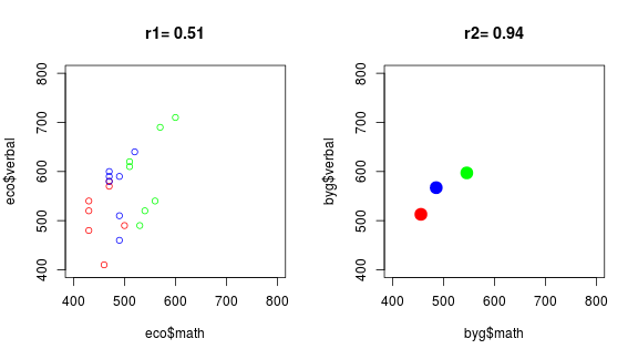
What are ecological correlations? Correlations done on ecological data? No. It is one of (many?) creative uses of statistical related techniques (another is what is called Simpson’s paradox, related to contingency tables, and of which you can read on FPP or https://en.wikipedia.org/wiki/Simpson%27s_paradox, or of ecological fallacy, of which you can read on http://www.stat.berkeley.edu/~census/ecofall.txt).
Link to data: https://rbertolusso.github.io/data/LR/eco_corre.csv
eco <- read.csv(file = "../data/LR/eco_corre.csv", stringsAsFactors = FALSE)

par(mfrow = c(1,2))

## Left panel
r <- round(cor(eco$math, eco$verbal), 2)
plot(eco$math, eco$verbal, col = eco$group,
     xlim = c(400, 800), ylim = c(400, 800), main = paste0("r1= ", r))

## Right panel
byg <- with(eco, data.frame(math = tapply(math, group, mean),
                            verbal = tapply(verbal, group, mean)))
rg <- round(cor(byg$math, byg$verbal), 2)
plot(byg$math, byg$verbal, col = row.names(byg), pch = 19, cex = 2,
     xlim = c(400, 800), ylim = c(400, 800), main = paste0("r2= ", rg))
The same, using magrittr pipes, dplyr and intubate (See
intubate <||> R stat functions in data science pipelines for an introduction
to intubate):
library(magrittr)
library(dplyr)
library(intubate)

eco <- read.csv(file = "../data/LR/eco_corre.csv", stringsAsFactors = FALSE)

par(mfrow = c(1,2))

## Left panel
eco %>% ntbt(cor, math, verbal) %>% round(2) -> r
eco %>%
  ntbt(plot, math, verbal, col = group, main = paste0("r1= ", r),
       xlim = c(400, 800), ylim = c(400, 800))

## Right panel
eco %>%
  group_by(group) %>%
  summarise(math = mean(math),
            verbal = mean(verbal)) -> byg
byg %>% ntbt(cor, math, verbal) %>% round(2) -> rg
byg %>%
  ntbt(plot, math, verbal, col = group, main = paste0("r2= ", rg),
       xlim = c(400, 800), ylim = c(400, 800), pch = 19, cex = 2)
-
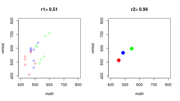
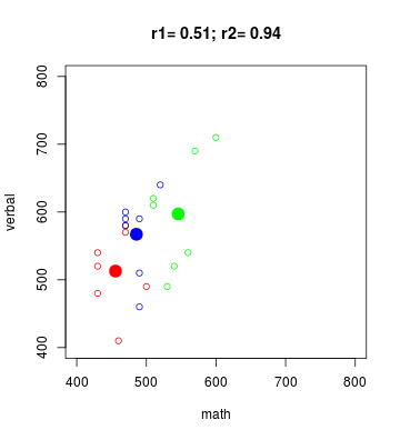
The left panel contains the raw data, the right panel aggregate data (means of each group). Ecological correlation means calculating the correlation from the data in the right panel, instead than from data in the left panel.
-
Why do you think someone would like to use the data on the right instead of the one on the left?
-
Superimposing both scatterplots:
eco %>%
  ntbt(plot, math, verbal, col = group,
       main = paste0("r1= ", r, "; r2= ", rg),
       xlim = c(400, 800), ylim = c(400, 800))
byg %>%
  ntbt(points, math, verbal, col = group, pch = 19, cex = 2)
-
Ecological correlations: based on rates or averages (used in political science and sociology). They tend to overstate the strength of an association.
-
Correlations based on rates or averages can be misleading.
-
This ends our discussion about Ecological correlations. We will continue with “normal” correlations from now on.
-
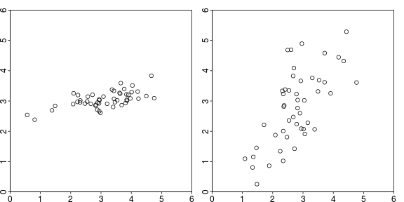
Question (for the expert in you): you are presented with the following plots (below), and asked, due to your expertise, to determine which of the panels corresponds to data with a higher correlation coefficient (in absolute value). What would be your answer?
Changing SDs
-
The appearance of a scatter diagram depends on the SDs. In fact, both plots above were generated with the same $r = 0.7$. The difference is that the one on the left had $\sigma_X = 1.1$ and $\sigma_Y = 0.3$, while the one on the right had $\sigma_X = 1$ and $\sigma_Y = 1.3$. However, the left one looks more tightly clustered than the other. It is due to the SDs, not $r$ (code in Appendix).
-
Calculating $r$ involves converting the variables to standard units where deviations from average are divided by the standard deviation.
-
$r$ measures clustering in relative terms (relative to the SDs) and not in absolute terms.
-
By the way, how do you feel, from now on, about guessing values of $r$ by looking at the scatterplot?
Discussion on calculation of the standard deviation
For simplicity, FPP use, unless it was a very small sample, SD instead of sd.
SD is obtained by dividing by $n$ instead of by $n - 1$ (R has the
function sd for the latter, and no function for the former).
Anyway, FPP clearly note (later for not confusing people with
technicalities on a book with just a few formulas),
that for small samples one should divide by $n - 1$.
To satisfy people who considers this an important issue, let us mention that the correct one is the one obtained by dividing by $n-1$ (because the associated sample variance is an unbiased estimator of the population variance, while the other is biased). On the other hand, if the points are the population (not a sample from it), the correct is the one dividing by $n$.
- By the way, as we are mentioning it, what does it mean that an estimator is unbiased?
However, the difference is, on cases say with about 40-50 data points or more, negligible (if you are using the right kind of data, which is what you should be doing), and in the case of Pearson’s data (1,078) the terrible error committed by using SD instead of sd is:
## FPP version of sample standard deviation
SD <- function(x) sqrt(mean((x-mean(x))^2))

## "Error" of using SD instead of "correct" sd
SD(x) - sd(x)
## [1] -0.001273425
SD(y) - sd(y)
## [1] -0.001305823
Is that 1/1000 of an inch?
Perhaps, there are far more worse errors one can commit (using data unsuitable to the statistical procedure comes to mind, or the other way around, using an unsuitable statistical procedure for the data that, after all, should drive the analysis), and insisting too much in technicalities such as this can make statistics rely too much in mathematical niceties, and too little on substance (just in case, know that I do not expect that you agree with me in any kind of remark I make. In fact, many of my remarks are just a consequence of my lack of certainty about which should be the correct answer).
By the way, the maximum likelihood estimator of the variance also divides by $n$ instead of $n-1$, so it is biased (and used).
We will show both approaches, that lead mostly to the same final results, pointing out when they disagree.
The SD line
-
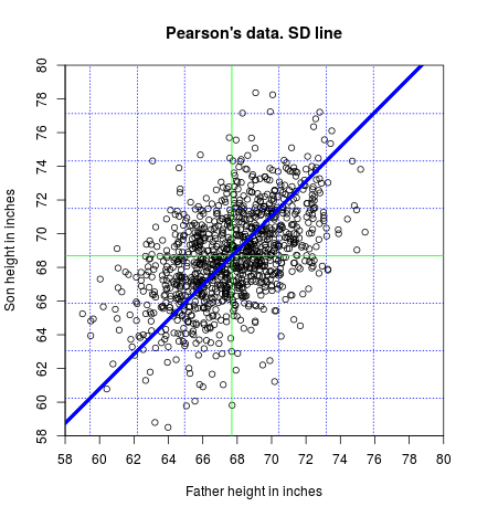
The SD line goes through the point of averages, passing through the points which are an equal number of SDs away from the average, for each variable.
-
This means that, if you move $n$ $\text{SD}_X$ to the right of $(\bar{X}, \bar{Y})$ and then $n$ $\text{SD}_Y$ above (or below if $r$ is negative) your previous position, you end on a point of the SD line.
-
We can find the SD line knowing that it passes throught two points: [ \frac{y-y_0}{x-x_0}=\frac{y_1-y_0}{x_1-x_0} ] using the points $(\bar{x},\bar{y})$ and $(\bar{x}+\text{SD}_x,\bar{y}+\text{SD}_y)$ [ \frac{y-\bar{y}}{x-\bar{x}}=\frac{\bar{y}+\text{SD}_y-\bar{y}}{\bar{x}+\text{SD}_x-\bar{x}}
\frac{y-\bar{y}}{x-\bar{x}}=\frac{\text{SD}_y}{\text{SD}_x}
y-\bar{y}=\frac{\text{SD}_y}{\text{SD}_x} (x-\bar{x})
]
Finally, the SD line using $\text{SD}$ is:
[ y=\frac{\text{SD}_y}{\text{SD}_x} x+\bar{y}-\frac{\text{SD}_y}{\text{SD}_x}\bar{x} ]
where $\frac{\text{SD}_y}{\text{SD}_x}$ is the slope and $\bar{y}-\frac{\text{SD}_y}{\text{SD}_x}\bar{x}$ is the intercept.
Of course, the same line is obtained using $\text{sd}$ instead of $\text{SD}$ (why?):
[ y=\frac{\text{sd}_y}{\text{sd}_x} x+\bar{y}-\frac{\text{sd}_y}{\text{sd}_x}\bar{x} ]
where $\frac{\text{sd}_y}{\text{sd}_x}$ is the slope and $\bar{y}-\frac{\text{sd}_y}{\text{sd}_x}\bar{x}$ is the intercept.
## SD line using equation and FFP SD
abline(a = meany - SD(y)/SD(x)*meanx,
       b = SD(y)/SD(x), col = "blue", lwd = 4)

## SD line using equation and sd
abline(a = meany - sd(y)/sd(x)*meanx,
       b = sd(y)/sd(x), col = "blue", lwd = 4)
-
Note that we have plotted the SD line twice, using $\text{SD}$ and $\text{sd}$, obtaining the same result.
-
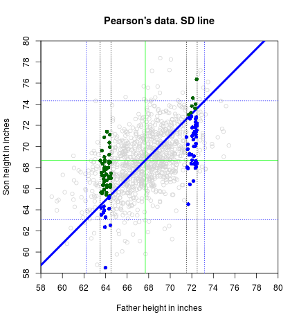
T or F: If you move one SDx to the right of the point of averages, would it be your best guess (prediction) of the son’s height the corresponding point on the SD line?
The graph of averages
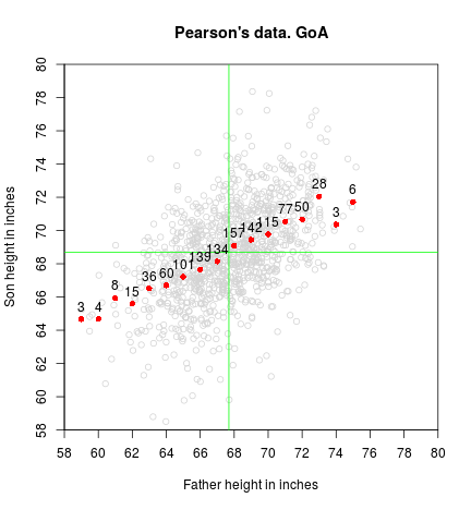
- If you partition your $x$ axis let’s say at every inch, the graph of averages is the collection of points where the $x$-coordinate is the center of the vertical strip, and the $y$-coordinate the mean of all the $y$-values contained in that strip. (Of course your selection of a different strip width will give a different result, as it happens with histograms)
## Graph of averages.
sgav <- with(father.son, tapply(sheight, round(fheight, 0), mean))
sgavnum <- with(father.son, tapply(sheight, round(fheight, 0), length))

points(as.numeric(names(sgav)), sgav, col = "red", pch = 16)
text(as.numeric(names(sgav)), sgav, sgavnum, pos = 3)
-
The GoA is close to a straight line in the middle, but not at the ends. Why do you think that happens?
-
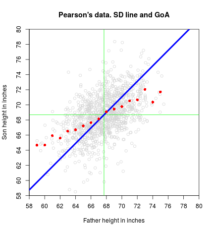
T or F: If we add to the GoA plot the SD line, would it more or less follow the GoA?
The Regression line and the Regression function
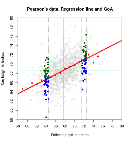
- The regression line is a smoothed version of the graph of averages. If the graph of averages follows a straight line (as happens on a scatterplot that is a football-shaped cloud of points), that straight line is the regression line.
-
In general, we could say that the regression function (meaning not limited to a straight line) estimates the average value for $y$ corresponding to each value of $x$.
-
More formally, and implying that we are making probability assumptions on $Y$ (that we will see in future notes when turning to a more boring - I mean rigorous - stage), the regression function is the conditional expectation of $Y$ given $X=x$, or $\text{E}[Y|X=x]$.
-
Repeter avec moi: The regression function is the conditional expectation of $Y$ given $X=x$.
-
Informally (I think, but I may be wrong…) we could say that the graph of averages is a “discrete” version (as it depends on the width of the strip) of the regression function (linear or non linear), and that if we could make the width of the strips go to zero, they should agree (provided we have an infinite number of points so we always have points inside the strips as their width vanishes).
-
Keep in mind that the regression line may smooth away too much. For example, if there is a non-linear association between the two variables, the regression line will pass it by. (We will see that there are situations where we can transform the data and still use linear regression. If not, we need to move to other non-linear methodologies).
-
Anyway, the graph of averages should always work.
-
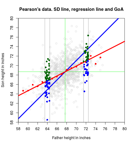
We have related GoA and regression line. Is there any relation between SD line and regression line?
-
OK, I did not show you the equation of the regression line (the one that is good for football-shaped clouds of points). We are going to give here a version that we will accept without proof. Later, we will formally derive another version that relies on calculus, and you will then be asked to reconcile both versions. Here it goes: [ y = r\frac{\text{SD}_y}{\text{SD}_x}x + \bar{y} - r\frac{\text{SD}_y}{\text{SD}_x}\bar{x} ] Or, using $\text{sd}$: [ y = r\frac{\text{sd}_y}{\text{sd}_x}x + \bar{y} - r\frac{\text{sd}_y}{\text{sd}_x}\bar{x} ]
-
If you already forgot (I would have), the equation of the SD line follows:
[ y = \frac{\text{SD}_y}{\text{SD}_x}x + \bar{y} - \frac{\text{SD}_y}{\text{SD}_x}\bar{x} ]
- Then, do you see any relation between SD line and regression line?
While you think we will put everything in one plot, showing the equation of the regression line:
abline(a = meany - r*sd(y)/sd(x)*meanx, b = r*sd(y)/sd(x),
       lwd = 4, col = "red")
-
The regression line is an attenuated version of the SD line. In the SD line, when you move 1 SDx to the right, you go 1 SDx above (or below for negative $r$). In the regression line, you only go $r$ SDy above (or below).
-
Question that is still unanswered from the beginning: we said that the correlation coefficient is a measure of linear association, or clustering about a line. Which is the line?
-
Answer:
- It is the SD line.
Appendix
Code for ecological correlations
## Generating correlated Normal data
diffr <- function(n, rho, SDx = 1, SDy = 1) {
  meanx <- 3; meany <- 3

  x1 <- rnorm(n = n)
  x2 <- rnorm(n = n)
  x3 <- rho*x1 + sqrt(1-rho^2)*x2

  x <- meanx + SDx*x1
  y <- meany + SDy*x3

  r <- round(cor(x, y), 3)

  plot(x, y, xlim = c(0,6), ylim = c(0,6),
       xaxs = "i", yaxs = "i")
}
set.seed(1)
par(mai = c(.2, .2, .2, .2), mgp = c(1.5, 0.2, 0),
    tck = -.01, mfrow = c(1,2))
diffr(rho = 0.70, n = 50, SDx = 1.1, SDy = .3)
diffr(rho = 0.70, n = 50, SDx = 1, SDy = 1.3)
Code to produce the SD line plot
plot(x, y,
     xlim = c(58, 80), ylim = c(58, 80),
     xaxt = "n", yaxt = "n", xaxs = "i", yaxs = "i",
     main = "Pearson's data. SD line",
     xlab = "Father height in inches", ylab = "Son height in inches")
axp <- seq(58, 80, by = 2)
axis(1, at = axp, labels = axp)
axis(2, at = axp, labels = axp)

## Spread of the cloud
abline(v = meanx + c(-3, -2, -1, 1, 2, 3)*sd(x), col = "blue", lty = 3)
abline(h = meany + c(-3, -2, -1, 1, 2, 3)*sd(y), col = "blue", lty = 3)

## Point of averages (center of the cloud)
abline(v = meanx, col = "green")
abline(h = meany, col = "green")

## SD line using equation and FFP SD
abline(a = meany - SD(y)/SD(x)*meanx,
       b = SD(y)/SD(x), col = "blue", lwd = 4)

## SD line using equation and sd
abline(a = meany - sd(y)/sd(x)*meanx,
       b = sd(y)/sd(x), col = "blue", lwd = 4)
Code to produce points in relation to the SD line plot
plot(x, y,
     xlim = c(58, 80), ylim = c(58, 80), col = "lightgrey",
     xaxt = "n", yaxt = "n", xaxs = "i", yaxs = "i",
     main = "Pearson's data. SD line",
     xlab = "Father height in inches", ylab = "Son height in inches")
axp <- seq(58, 80, by = 2)
axis(1, at = axp, labels = axp)
axis(2, at = axp, labels = axp)

## Spread of the cloud
abline(v = meanx + c(-2, 2)*sd(x), col = "blue", lty = 3)
abline(h = meany + c(-2, 2)*sd(y), col = "blue", lty = 3)

## Point of averages (center of the cloud)
abline(v = meanx, col = "green")
abline(h = meany, col = "green")

## SD line using equation and sd
abline(a = meany - sd(y)/sd(x)*meanx,
       b = sd(y)/sd(x), col = "blue", lwd = 4)

fround <- 72
abline(v = fround + c(-.5,.5), lty = 3)
with(subset(father.son, round(fheight,0) == fround),
     points(fheight, sheight, pch = 16,
            col = ifelse(sheight > meany + (fheight - meanx)/sd(x)*sd(y),
                         "darkgreen", "blue")))

fround <- 64
abline(v = fround+c(-.5, .5), lty = 3)
with(subset(father.son, round(fheight,0) == fround),
     points(fheight, sheight, pch = 16,
            col = ifelse(sheight > meany + (fheight - meanx)/sd(x)*sd(y),
                         "darkgreen", "blue")))
Code to produce the Graph of Averages plot
plot(x, y,
     xlim = c(58, 80), ylim = c(58, 80), col = "lightgrey",
     xaxt = "n", yaxt = "n", xaxs = "i", yaxs = "i",
     main = "Pearson's data. GoA",
     xlab = "Father height in inches", ylab = "Son height in inches")
axp <- seq(58, 80, by = 2)
axis(1, at = axp, labels = axp)
axis(2, at = axp, labels = axp)

## Point of averages (center of the cloud)
abline(v = meanx, col = "green")
abline(h = meany, col = "green")

## Graph of averages.
sgav <- with(father.son, tapply(sheight, round(fheight, 0), mean))
sgavnum <- with(father.son, tapply(sheight, round(fheight, 0), length))

points(as.numeric(names(sgav)), sgav, col = "red", pch = 16)
text(as.numeric(names(sgav)), sgav, sgavnum, pos = 3)
Code to produce the Graph of Averages + SD line plot
plot(x, y,
     xlim = c(58, 80), ylim = c(58, 80), col = "lightgrey",
     xaxt = "n", yaxt = "n", xaxs = "i", yaxs = "i",
     main = "Pearson's data. SD line and GoA",
     xlab = "Father height in inches", ylab = "Son height in inches")
axp <- seq(58, 80, by = 2)
axis(1, at = axp, labels = axp)
axis(2, at = axp, labels = axp)

## Point of averages (center of the cloud)
abline(v=meanx, col="green")
abline(h=meany, col="green")

## SD line using equation and sd
abline(a = meany - sd(y)/sd(x)*meanx,
       b = sd(y)/sd(x), col = "blue", lwd = 4)

## Graph of averages.
sgav <- with(father.son, tapply(sheight, round(fheight, 0), mean))
points(as.numeric(names(sgav)), sgav, col = "red", pch = 16)
Code to produce the Regression line plot
plot(x, y,
     xlim = c(58, 80), ylim = c(58, 80), col = "lightgrey",
     xaxt = "n", yaxt = "n", xaxs = "i", yaxs = "i",
     main = "Pearson's data. Regression line and GoA",
     xlab = "Father height in inches", ylab = "Son height in inches")
axp <- seq(58, 80, by = 2)
axis(1, at = axp, labels = axp)
axis(2, at = axp, labels = axp)

## Point of averages (center of the cloud)
abline(v = meanx, col = "green")
abline(h = meany, col = "green")

## Graph of averages.
sgav <- with(father.son, tapply(sheight, round(fheight,0), mean))
points(as.numeric(names(sgav)), sgav, col = "red", pch = 16)

## Regression line
abline(a = meany - r*sd(y)/sd(x)*meanx, b = r*sd(y)/sd(x),
       lwd = 4, col = "red")

fround <- 72
abline(v = fround + c(-.5, .5), lty = 3)
with(subset(father.son, round(fheight, 0) == fround),
     points(fheight, sheight,  pch = 16,
            col = ifelse(sheight > meany + (fheight - meanx)/sd(x)*sd(y)*r,
                         "darkgreen", "blue")))

fround <- 64
abline(v = fround + c(-.5, .5), lty = 3)
with(subset(father.son, round(fheight, 0) == fround),
     points(fheight, sheight, pch = 16,
            col = ifelse(sheight > meany + (fheight - meanx)/sd(x)*sd(y)*r,
                         "darkgreen", "blue")))
Code to produce the plot with everything
plot(x, y,
     xlim = c(58, 80), ylim = c(58, 80), col = "lightgrey",
     xaxt = "n", yaxt = "n", xaxs = "i", yaxs = "i",
     main = "Pearson's data. SD line, regression line and GoA",
     xlab = "Father height in inches", ylab = "Son height in inches")
axp <- seq(58, 80, by = 2)
axis(1, at = axp, labels = axp)
axis(2, at = axp, labels = axp)

## Point of averages (center of the cloud)
abline(v = meanx, col = "green")
abline(h = meany, col = "green")

## SD line using equation and sd
abline(a = meany - sd(y)/sd(x)*meanx,
       b = sd(y)/sd(x), col = "blue", lwd = 4)

## Graph of averages.
sgav <- with(father.son, tapply(sheight, round(fheight, 0), mean))
points(as.numeric(names(sgav)), sgav, col = "red", pch = 16)

## Regression line
abline(a = meany - r*sd(y)/sd(x)*meanx, b = r*sd(y)/sd(x),
       lwd = 4, col = "red")

fround <- 72
abline(v = fround + c(-.5, .5), lty = 3)
with(subset(father.son, round(fheight, 0) == fround),
     points(fheight, sheight, pch = 16,
            col = ifelse(sheight > meany + (fheight - meanx)/sd(x)*sd(y)*r,
                         "darkgreen", "blue")))

fround <- 64
abline(v = fround + c(-.5, .5), lty = 3)
with(subset(father.son, round(fheight, 0) == fround),
     points(fheight, sheight, pch = 16,
            col = ifelse(sheight > meany + (fheight - meanx)/sd(x)*sd(y)*r,
                         "darkgreen", "blue")))