LR01: Correlation
This is the first of a series of posts on the subject of linear regression, using R for computational demonstrations and examples. I hope you find it useful, but I am aware it may contains typos and conceptual errors (mostly when I try to think instead of just repeating what others thought…). Help on correcting/improving these notes is appreciated. This first post deals with the subject of correlation.
- Acknowledgments: organization is extracted from:
- Freedman, Pisani, Purves, Statistics, 4th ed., probably the best book on statistical thinking (it maybe has a total of 4-5 formulas). It is referred here as FPP.
- A lot of what is good is due to Professor Rudy Guerra.
-
What is regression? For now let’s say that it is related with averages of a certain kind.
-
What is (Pearson) correlation? We will define it in a little bit, but let’s start by saying that it is a measure of linear association between classes (inter-class correlation) and not between the elements of a given class (or intra-class correlation. For the latter, see https://en.wikipedia.org/wiki/Intraclass_correlation for an introduction).
-
We are interested in studying the relationship between two (or more) variables (each variable belongs to one class).
-
Sir Francis Galton (England, 1822-1911) made some progress on this while thinking about resemblance of parents and sons.
-
Galton’s disciple Karl Pearson (England, 1857-1936) measured the heights of 1,078 fathers and their sons at maturity.
## install.packages("UsingR")
library(UsingR)

## Pearson's data
## Father and son data
data(father.son)
dim(father.son)
## [1] 1078 2
str(father.son)
## 'data.frame':	1078 obs. of  2 variables:
##  $ fheight: num  65 63.3 65 65.8 61.1 ...
##  $ sheight: num  59.8 63.2 63.3 62.8 64.3 ...
head(father.son) ## First six pairs
##    fheight  sheight
## 1 65.04851 59.77827
## 2 63.25094 63.21404
## 3 64.95532 63.34242
## 4 65.75250 62.79238
## 5 61.13723 64.28113
## 6 63.02254 64.24221
tail(father.son) ## Last six pairs
##       fheight  sheight
## 1073 67.70657 59.81693
## 1074 66.99681 70.75232
## 1075 71.33181 68.26774
## 1076 71.78314 69.30589
## 1077 70.73837 69.30199
## 1078 70.30609 67.01500
-
1,078 pairs of heights are hard to grasp.
-
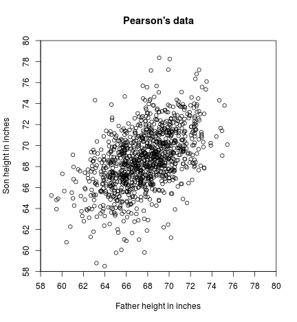
A visual relationship between two variables can be manifested in a scatter diagram, where each dot on the diagram represents one father-son pair:
- x-coordinate: the height of the father.
- y-coordinate: the height of the son.
x <- father.son$fheight
y <- father.son$sheight

plot(x, y,
     xlim = c(58, 80), ylim = c(58, 80),
     xaxt = "n", yaxt = "n", xaxs = "i", yaxs = "i",
     main = "Pearson's data",
     xlab = "Father height in inches", ylab = "Son height in inches")
axp <- seq(58, 80, by = 2)
axis(1, at = axp, labels = axp)
axis(2, at = axp, labels = axp)

-
The scatter diagram above is a cloud shaped something like a football (just in case, the American football, not the round one I am more used to), with points straggling off the edges.
-
For a rough sketch of such a scatter diagram, it is only necessary to show the main oval portion.
-
Points in father and son’s data slopes upward to the right (y-coordinates tending to increase with their corresponding x-coordinates).
-
This is considered a positive linear association between heights of fathers and sons. In general, taller fathers => taller sons (confirmation of the obvious).
-
Let’s draw a 45-degree line $y = x$. (What would it represent?)
plot(x, y,
     xlim = c(58, 80), ylim = c(58, 80),
     xaxt = "n", yaxt = "n", xaxs = "i", yaxs = "i",
     main = "Pearson's data",
     xlab = "Father height in inches", ylab = "Son height in inches")
axp <- seq(58, 80, by = 2)
axis(1, at = axp, labels = axp)
axis(2, at = axp, labels = axp)

abline(a = 0, b = 1, lty = 2)

-
The 45-degree line corresponds the families son’s height = father’s height. e.g.: if father is 72 inches tall then son is 72 inches tall; if father is 64 inches tall, the son is 64 inches tall too.
-
If a son’s height is close to his father’s height, its point is close to the line.
-
In the actual scatter plot there is a lot more spread around the 45-degree line, showing the weakness of the relationship (or association) between father’s height and son’s height.
-
Suppose you have to guess the height of a son. How much helps knowing the father’s height?
-
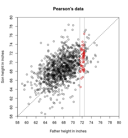
Let’s draw a chimney containing father-son pairs where the father is 72 inches tall to the nearest inch ($71.50 \leq x < 72.49$).
plot(x, y,
     xlim = c(58, 80), ylim = c(58, 80),
     xaxt = "n", yaxt = "n", xaxs = "i", yaxs = "i",
     main = "Pearson's data",
     xlab = "Father height in inches", ylab = "Son height in inches")
axp <- seq(58, 80, by = 2)
axis(1, at = axp, labels = axp)
axis(2, at = axp, labels = axp)

abline(a = 0, b = 1, lty = 2)

## Families where father is 72 inches tall (to the nearest inch)
## plotted in a vertical strip.
abline(v=c(71.5, 72.5), lty = 3)
with(subset(father.son, fheight >= 71.5 & fheight < 72.5),
     points(fheight, sheight, col="red"))
-
There is still a lot of variability in the heights of the sons, (see at vertical scatter in the chimney).
-
Knowing the father’s height still leaves lot of room for error in trying to guess the his son’s height.
-
When there is a strong association between two variables, knowing one helps significantly in predicting (guessing) the other. When there is a weak association, knowing one variable does not help much in guessing (predicting) the other.
-
In social science (and other disciplines) studies of relationship between two variables, it is usual to call one as independent and the other as dependent. Usually too, the independent one is thought to influence the dependent one (rather than the other way around).
-
In our example, father’s height is considered independent, as if father’s height influences son’s height. However, we could use son’s height as the independent variable. This would be appropriate if the problem were to guess a father’s height from his son’s height.
(Pearson) correlation coefficient
-
How can we summarize the relationship between two variables, when (meaning not always, but in cases where) the scatter plot is a football-shaped cloud of points?
-
A very popular choice is by calculating the Pearson correlation coefficient.
-
First let’s note that the 1,078 pairs should have been obtained by randomly selecting a sample from a population. In our case, the population would be the totality of pairs of father-son’s heights (of course at the time the study happened (?), in the city (?) or neighborhood (?), or university where Pearson studied (?) or who knows of what that sample was representative of. We should go to the original paper to maybe find out. By the way, we should also find out how much Galton and Pearson knew at the time of this particular study of randomness in sampling and of statistical assumptions and properties. Remember that Galton died in 1911 and Pearson in 1936).
-
For historical reference, look at the following extracted from Wikipedia (https://en.wikipedia.org/wiki/Sampling_(statistics)#History): “In the USA the 1936 Literary Digest prediction of a Republican win in the presidential election went badly awry, due to severe bias. More than two million people responded to the study with their names obtained through magazine subscription lists and telephone directories. It was not appreciated that these lists were heavily biased towards Republicans and the resulting sample, though very large, was deeply flawed”.
-
If we would know all the pairs that belong to the population, we could find out the true correlation coefficient, that would be a parameter (a constant) of that population.
-
The population correlation coefficient is defined as:
-
Question: which is the mathematical definition of $\text{Cov}(X, Y)$, $\sigma_X$, and $\sigma_Y$?
-
In our case we have the sample (that we will would like for it to be random and representative of the population. Again, we should really verify this: remember that no sophisticated mathematical manipulation will magically protect you from using a non-representative sample). To estimate the population correlation coefficient $\rho$, we can use the sample correlation coefficient $r$, that is a statistic (a random variable, not a constant such as $\rho$). One version of its formula, suitable for our purposes is:
where $(x_1, y_1)$, $(x_2, y_2)$, $\cdots$, $(x_n, y_n)$ are the $n$ sample pairs.
- Note about notation: in rigor, if we consider $r$ a statistic (meaning that it is a random variable), we should write its definition using capital letters (using $X_i$, $Y_i$, $\bar{X}$, and $\bar{Y}$, as $X_i$ and $Y_i$ are random samples from random variables $X$ and $Y$). We are using lower-case here because we are not necessarily doing probabilitic assumptions, and we could potentially use this definition to calculate “correlation” of any two groups of paired data. There is another note at the end that continues this discussion. By the way, at least to my knowledge, $r$ is always given in lower case, even when considered a random variable.
## Generating correlated Normal data

diffr1 <- function(n, rho, SDx = 1, SDy = 1) {
  meanx <- 3; meany <- 3

  x1 <- rnorm(n = n)
  x2 <- rnorm(n = n)
  x3 <- rho*x1 + sqrt(1-rho^2)*x2

  x <- meanx + SDx*x1
  y <- meany + SDy*x3

  r <- round(cor(x, y), 3)

  plot(x, y, xlim = c(0,6), ylim = c(0,6),
       xaxs = "i", yaxs = "i", main = paste("rho =", rho, "; r = ", r))
}

## Alternative, using multivariate normal.
library(mvtnorm)

diffr2 <- function(n, rho, SDx = 1, SDy = 1) {
  ## mean vector
  mu <- c(3, 3)
  ## variance-covariance matrix.
  sigma <- matrix(c(SDx^2      , rho*SDx*SDy,
                    rho*SDx*SDy, SDy^2), nrow = 2, byrow = TRUE)

  sim <- rmvnorm(n, mu, sigma)
  x <- sim[, 1]
  y <- sim[, 2]

  r <- round(cor(x, y), 3)

  plot(x, y, xlim = c(0,6), ylim = c(0,6),
       xaxs = "i", yaxs = "i", main = paste("rho =", rho, "; r = ", r))
}

## Let's use alternative 1
diffr <- diffr1
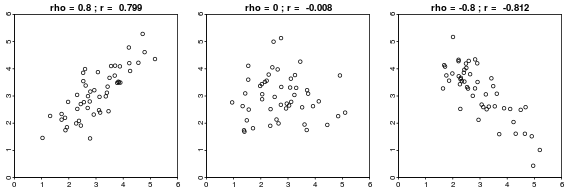
- Let’s see some randomly generated cases corresponding to a populations with given $\rho$:
set.seed(123)
par(mai = c(.2, .2, .2, .2), mgp = c(1.5, 0.2, 0),
    tck = -.01, mfrow = c(1,3))
diffr(rho = 0.80, n = 50)
diffr(rho = 0, n = 50)
diffr(rho = -0.80, n = 50)
## What happens if r=1?
-
The first fact we observe is that $\rho$ and $r$ differ (why?)
- The second fact is that:
- positive $r$ $\Longleftrightarrow$ positive linear association (as with father and son’s height data)
- negative $r$ $\Longleftrightarrow$ negative linear association
- Discussion (with your colleagues): why $r$ has to be positive in the case of father and son’s data? (Hint: look at the definition of $r$)
plot(x, y,
     xlim = c(58, 80), ylim = c(58, 80),
     xaxt = "n", yaxt = "n", xaxs = "i", yaxs = "i",
     main = "Pearson's data",
     xlab = "Father height in inches", ylab = "Son height in inches")
axp <- seq(58, 80, by = 2)
axis(1, at = axp, labels = axp)
axis(2, at = axp, labels = axp)
- Let’s see again the formula for $r$:
- We see that it uses averages:
Let’s get them using R:
(meanx <- mean(x))
## [1] 67.6871
(meany <- mean(y))
## [1] 68.68407
-
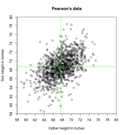
The pair $(\bar{x}, \bar{y})$ is called the point of averages, and locates the center of the cloud.
-
Let’s draw a horizontal and a vertical line passing through the point of averages:
plot(x, y,
     xlim = c(58, 80), ylim = c(58, 80),
     xaxt = "n", yaxt = "n", xaxs = "i", yaxs = "i",
     main = "Pearson's data",
     xlab = "Father height in inches", ylab = "Son height in inches")
axp <- seq(58, 80, by = 2)
axis(1, at = axp, labels = axp)
axis(2, at = axp, labels = axp)

## Point of averages
abline(v=meanx, col="green")
abline(h=meany, col="green")
-
We observe that, relative to the point of averages, the points have coordinates $(x_i-\bar{x}, y_i-\bar{y})$, and that, always relative to the point of averages, the points are situated in four quadrants.
-
From the numerator of the formula, we observe it is a sum of the following products:
Let’s calculate those products with R:
num_prod <- (x-meanx)*(y-meany)

## See the first results
num_prod[1:30]
##  [1] 23.4987260 24.2659096 14.5921950 11.3980443 28.8386686 20.7193070
##  [7] 10.6602839 13.8920687  6.6026866  3.3860013 29.8522714 15.8488740
## [13] 12.0660676 11.7337326 10.1656882  9.8610550  4.8145636  6.6206614
## [19]  1.1508456  2.9634055 -0.3923032 -5.8598975 10.8071150  8.9388582
## [25]  8.1936002  7.3768431  8.1223945  4.3498337  6.4173945  5.7854412
Most are positive, but some are negative.
- Let’s color each point according to the sign (positive or zero: blue, negative: red) of the result of the products:
col <- ifelse(num_prod >= 0, "blue", "red")
plot(x, y,
     xlim = c(58, 80), ylim = c(58, 80),
     xaxt = "n", yaxt = "n", xaxs = "i", yaxs = "i", col = col,
     main = "Pearson's data",
     xlab = "Father height in inches", ylab = "Son height in inches")
axp <- seq(58, 80, by = 2)
axis(1, at = axp, labels = axp)
axis(2, at = axp, labels = axp)

abline(v=meanx, col="green")
abline(h=meany, col="green")
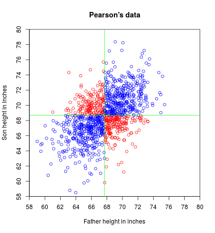
- Let’s find the sums of both groups:
(sum_pos_num_prod <- sum(num_prod[num_prod >= 0]))
## [1] 4975.409
(sum_neg_num_prod <- sum(num_prod[num_prod < 0]))
## [1] -803.8301
- We observe that the sum of the positive products is greater (in absolute value) than the sum of the negative products (also in absolute value).
Then:
(total_sum_num_prod <- sum_pos_num_prod + sum_neg_num_prod)
## [1] 4171.579
will be positive.
-
This settles the sign of $r$ (why?).
-
The problem is that the obtained quantity does not give insight on the strength of the linear association (it strongly depends on the magnitude of the values) and it is non-comparable with similarly obtained quantities from other data. What do we do?
-
We “standardize”, by dividing by kind of “standard deviations” (why kind of?):
(kind_of_sdx <- sqrt(sum((x - meanx)^2)))
## [1] 90.08021
(kind_of_sdy <- sqrt(sum((y - meany)^2)))
## [1] 92.37197
and we are set!
(r <- total_sum_num_prod / (kind_of_sdx * kind_of_sdy))
## [1] 0.5013383
- Of course, we did not need to sweat this much. We could just have asked R for it (in retrospective, I do not know why we did the above, when we could have just done):
cor(x, y)
## [1] 0.5013383
- Let’s play with the formula of $r$:
where $\text{su}$ stands for “standard units”.
- The third variant:
is the sampling counterpart of the definition that we gave for $\rho$ (the population correlation coefficient). Remember? No? OK, Here it goes again:
In fact
-
Important note: we are using capital letters here to indicate that $X_i$ and $Y_i$ are being considered random samples (random variables themselves) from random variables $X$ and $Y$, and that we want to estimate the population $\text{Cov}(X, Y)$, $\sigma_X$, and $\sigma_Y$ using the random samples. $\hat{\text{Cov}}(X, Y)$, $\hat{\sigma}_X$, and $\hat{\sigma}_Y$ will be used as estimators of their population counterparts. So these are general procedures that will produce different estimates for every realization, because they are random procedures, as they depends on random variables (a random sample is a collection of iid random variables). In the derivations above we are using lower case letters because:
- either they can be considered as representing a particular realization of the general procedure (so they are already constants),
- and/or because we are not necessarily considering that they are the result of a random sampling. In other words, you could potentially find the “correlation” of any two groups of paired values. The fact that doing that may be a good or bad idea belongs to a different discussion. We are still not making any probabilistic or statistical assumption about the origin of the data, as it happens in descriptive statistics. We only said that the sensible thing to do would be to use correlation for football-shaped clouds of points (which intrinsically means that they should have been generated from a bivariate normal distribution…).
leading to:
that resembles the population counterpart, and we can easily “verify” with R:
(r <- cov(x, y)/ (sd(x)*sd(y)))
## [1] 0.5013383
- The last variant:
shows that $r$ is no other thing than the sum of the product of the variables in standard units, divided by $n - 1$.
Again, using R for “confirmation”:
su <- function(x)
  (x-mean(x))/sd(x)

sux <- su(x)
suy <- su(y)

n <- length(x)         ## Could also be length(y)

sum(sux * suy) / (n - 1)
## [1] 0.5013383
- There are other variants (we may see them later again). One that is computationally
convenient (if there is something more convenient than calling R
cordirectly), is:
(It wouldn’t be a bad idea if you try to get to this version. You never know.)
- There are also names associated to some (at least) of the sums when in the context of regression (we will see them later). (By the way, I am very bad with names…)
Facts about the sample correlation coefficient:
-
$\rho$ and $r$ differ (and both are pure numbers, without units)
-
- positive $r$ $\Longleftrightarrow$ positive linear association (as with father and son’s height data)
- negative $r$ $\Longleftrightarrow$ negative linear association
- [ |r| \leq 1 ]
(why? See Cauchy-Schwarz inequality if interested)
-
$r(x, y) = r(y, x)$
-
$r(x, y) = r(x, c + y)$
($c$ is any constant)
- $r(x, y) = r(x, c\cdot y)$
($c$ is a positive constant. A negative number will change the sign of r)
- You think about why 4, 5 and 6 are true mathematically. By the way, if you like names, you could say that 5 and 6 determine that $r$ is not affected by affine transformations.
“Proofs” using R:
cor(x, y)
## [1] 0.5013383
## 4
cor(y, x)
## [1] 0.5013383
## 5
cor(x, 5 + y)
## [1] 0.5013383
## 6
cor(x, 3 * y)
## [1] 0.5013383
## 7 (5 and 6)
cor(x, 5 + 3 * y)
## [1] 0.5013383